Monday, 30 October 2017

Scrap Matrix Challenge November 2017- Watercolour and Words

Hello scrappy friends, welcome back to my blog where today I'm sharing something I created for the Scrap Matrix October challenge. 

The challenge is called "Watercolour and Words. " Create something using a watercolour product (so many choices!) and include words of some sort (stickers, stencilled, chipboard etc)
I was inspired by the Design Team and their amazing projects and decided to have a play with my under used Dylusions water colour inks.  These are available at Scrap Matrix.

Having noticed various splattered trees on Pinterest, I wanted to attempt that
technique and add a quote which means a lot to me.

After five or six attempts, all of which ended up in the bin, I was ready to call it a day, but then on one the last try, I achieved the shape I was aiming for.   
Such an frustrating and enjoyable project - it leaves me wanting to know more about water colours and why they behave the way they do. 

Thanks for calling in today, it's always a joy to read your comments.  
They are so much appreciated.  

Sunday, 15 October 2017

Stuck?! Sketches! DT post 15 October 2017 - Love


Sunday, 1 October 2017

Stuck?! Sketches DT post - 15th October 2017 - Love

Welome back to my blog today where I'm sharing a DT page for 
Stuck?! Sketches!
This sketch was a joy to work with and my page came together easily. 
That doesn't always happen - sometimes I search for hours for just the right paper 
which I know I have tucked away in a safe place!

The papers are from Blue Fern, Seaside Cottage.   "Regalia" is the background
and I fussy cut the topper and the tag from Blush, "Devoted."
The enamel heart is by Pink Paislee - Oh my heart charms.
The enamel dots are from Doodlebug shape sprinkles, Bubbles.  
The chipboard title, is from Scrapmatts, CB6115 Assorted Words 28
covered it with Tattered Angels chalboard mist, Mint chocolate chip, 
before wet embossing with Ranger Bridal Tinsel.
The background texture was applied through a Scrapmatts stencil. ST9012 A4
The charms fabric heart was just the right colour for my page - it's from Charms Creations
I love the texture and the butterfly button.
I sprinkled some sequins around randomly - they are Springtime mix from Pretty Pink Posh.

The journalling is on the back of the page and it reads:-
This photo was taken in the Winter when we spent a week at your home. You had grown so much since Mother's day when we last saw you. You had started eating big people's food like pumpkin and avocado through a little net bag with a handle. I'd never seen such an thing, but you knew how to hold the handle and direct the food into your mouth.  You were a happy little Bubba, delighted to play with your dog, listen to stories, have big snuggles and smile all day long.  That is until it was time for sleeping!  Then the battles began.  You were quite happy to be held to go to sleep, but there was something deeply suspicious in your cot and you were not keen on going in there at all.  Your parents were so sleep deprived, that they allowed me to mind you for a few hours during the night. Daddy arrived in the wee small hours with you, your wrap, your dummy, your milk and your dance moves.  What fun we had, with you struggling to get out of the wrap, jumping up and down like a tap dancer and spitting out your dummy.   You were not crying, just not in the mood for sleeping.  So we snuggled up and observed each other at close range, until eventually Mr Sandman coaxed your eyes shut and you slept!  I enjoyed helping out and it brought back memories of your Daddy doing similar things when he was a Baby.
Love Granny - 24th July 2017

I hope you will feel inspired to join in and be eligible for one of the lovely prizes

Our sponsors this time are:-

Thanks for calling in.   I love it when you leave a comment; I so enjoy reading them.

If this is your first visit to my blog - welcome, I hope you found something to inspire you. 

Thursday, 12 October 2017

October Creating for Scrapmatts DT - Precious Time layout and a Masculine Card

Hello and welcome back to to my blog
I have two projects today designed for Scrapmatts.

First I'm sharing a layout about our newest Grand Baby and her Pa. 
I used a sketch from Laura Whitaker, it's from August 2016 
Scrapmatts sponsors her site regularly. 
So happy to use the strip of flower paper at the back, It was one of the first ones I bought,  so is almost an antique!   It's by Scenic Route Paper Co. Charlotte, "Strip combo.  
http://scrappinaroundtheclock.blogspot.com.au
The pink circle was cut from Echo Park, "Princess Journalling".
The stencilling is hard to see, but it looks lovely IRL.  ST5030

The flower and leaf cluster is from Scrapmatts CB5166 Leaf Spray 15.
After using white gesso, I inked  and stamped it with water colours.  
The Family title is from Scrapmatts words.
The quote square is from Scrapberry, Elegantly simple collection.


The journalling is on the back of the page and it reads:-
We were staying with you for a week and loved the chance to get to know you better. It's hard when you live so far away, but we make every day count when we are with you. It was fun watching you learn to feed yourself, trying to crawl and interacting with the dog. You were always content in your Grandfather's arms and despite not sleeping well, you are a happy and friendly baby.   Love Granny 21st July 2017

Next up is a masculine card - it could be for a Birthday, Graduation or Father's day.
I used some older Graphic 45 paper for the background
before adding Oxide ink through a stencil on Kraft. ST 9005-A6
The mottled colour on the tag was created with Oxides too.
The Penny Farthing CB 1012 was inked and embossed in black.
The sentiment is from CB1239 Scrap Words 25 

Did you know you can order direct from Scrapmatts?
CLICK HERE to see the amazing range.

Monday, 2 October 2017

Stuck?! Sketches! DT post 1st October 2017 - Wherever possible choose adventure

Welome back to my blog today where I'm sharing a DT page for
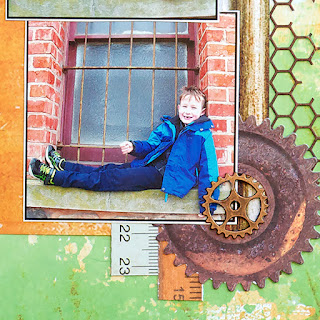
I like that this sketch uses multiple photos and still leaves room for white space. 

The background paper is an older one; it's by Kaisercraft, "Basecoat" collection. 
I teamed it with a new Kaisercraft collection, called "Factory 42" 
using the cogs and pipes from the collectables kit. 
The metal cogs are from my stash, I'm not sure where I sourced them.
The rulers are also Kaisercraft, "Photo friendly"
The mesh on the side is from a die lent to me by my friend at a Scrapping day.  
Thank you Marilyn. 

The journalling is on the back of the page and it reads:-
We were lucky enough to have you for a whole day during the Winter School Holidays and decided to take you to Port Adelaide to see the "Faile",  a 151' ketch built in 1909 and the "Adelaide" the worlds oldest clipper ship, which was used to transport passengers and goods from the Britain to Adelaide. Perhaps some of your ancestors arrived on her?
Of course I took my camera in the hope that a change of surrounding might evoke enthusiasm for photos, but it was so cold we found it difficult to get a spot out of the biting wind.  The Port is full of wonderful old buildings, history and Graffiti and I'd like to take you all back there next holidays.  Love Granny, 17th July 2017.

I hope you will feel inspired to join in and be eligible for one of the lovely prizes.

Our sponsors this time are:-  
They are donating a $25.00 Gift Certificate for their online store. 


They are donating a themed prize pack.

I enjoy reading your comments and appreciate you leaving them.  Thank you.

If this is your first visit to my blog - welcome, I hope you found something to inspire you.   New followers are very welcome, just click on the Follow me on Bloglovin' button.

Sunday, 1 October 2017

Kraft+ October challenge - Louvre

Hello again Scrappy Friends, welcome to October where today I'm sharing a post for 

Kraft+
The challenge is to use see through materials on your layout, with Kraft as your background.  First, I went looking for a photo to suit the theme and came up with this one of the Louvre, a striking glass building in Paris.  Then what to use to support the photo?  Some of my teamies helped out with suggestions.  Think Vellum, Acetate, Clear letters etc.  So I rummaged around in my stash and liberated some older products and I'm happy with the result.
Everything old is new again!
The gold and vellum triangle was created with a remnant of Crate paper.
The patterned paper at the bottom is an old, old piece by 7 Gypsies called Fleur de Lys.
The stamped chevrons are by VivaLasVegaStamps.
The clear letters are also old, Heidi Swapp Ghost letters, I coloured them with
Tim Holtz alcohol inks and stitched them down.
The stamped image is Fleur de Lys from Stampers Anonymous
which I wet embossed with "Aged Taupe" by Stampendous.
The film strip is from Tim Holtz.

The journalling is on the back of the page and it reads:-
This stunning building is a newer addition to the enormous Louvre and I love the contrasting architecture between the old and the new. Can't help but wonder about the debate between the conservatives and progressives, which preceded the approval for the building.  Maybe it was a bit like the nonsense that went on in Sydney during the construction of the landmark Opera House.  We queued with hordes of other tourists to see the Mona Lisa; so much smaller than I imaged her to be; and preferred less crowded spaces like the Degas exhibition.
I enjoy reading your comments and appreciate you leaving them.  Thank you.
If you leave details of you blog, I'd be happy to return the favour.